Image via
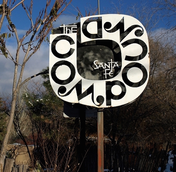
As a part of my series called My Santa Fe, I bring you to one of my favorite eateries in the city- The Compound Restaurant– the identity of which was designed by my favorite designer/architect (of. all. time) Alexander Girard. His eye for space design, typography, textiles and color culminate in what is now this Santa Fe mainstay. And with head chef Mark Kippin having received the esteemed James Beard award for best chef in the Southwest, you can image that the food isn’t bad either. 😉
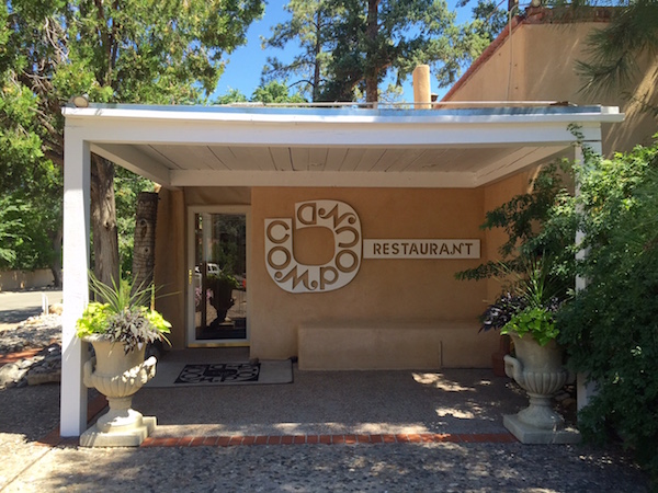
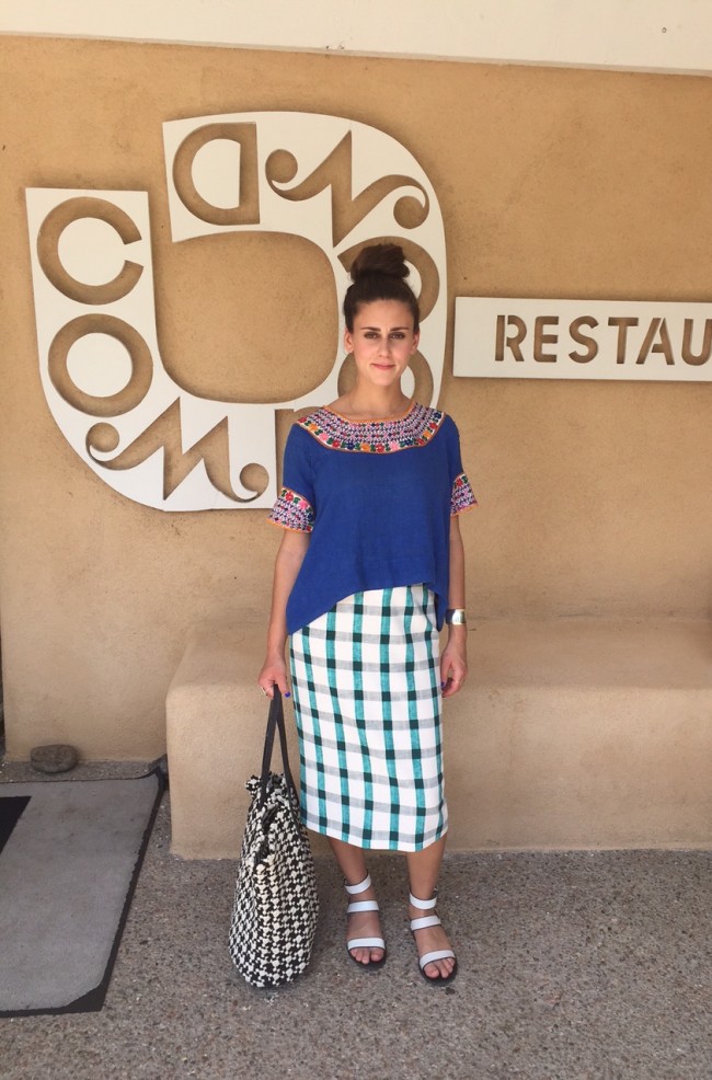
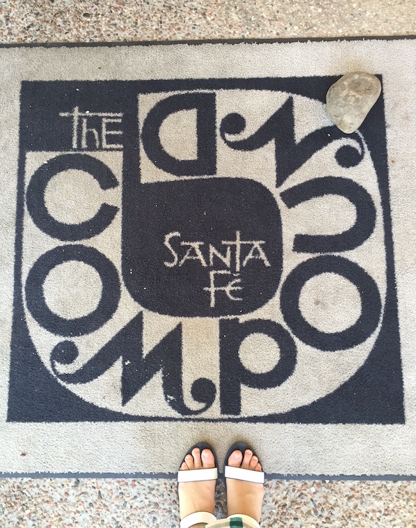
The restaurant logo, as seen above and below, really reflects upon the playfulness of Girard’s typographical style (check out some of his fonts here). It perfectly sets the stage for the design of the restaurant inside.
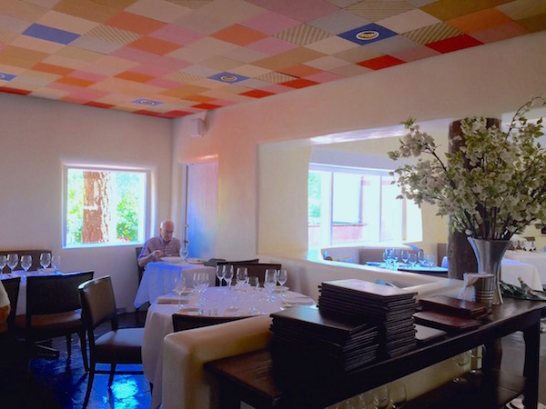
Now, to my favorite part of the restaurant: this paneled textile ceiling. Though Girard first received his training as an architect, he later ventured into textile design (and I’m so glad he did!), with jobs as the head of textiles for Herman Miller, and as a collaborator on many projects with the likes Charles Eames and Eero Saarinen.
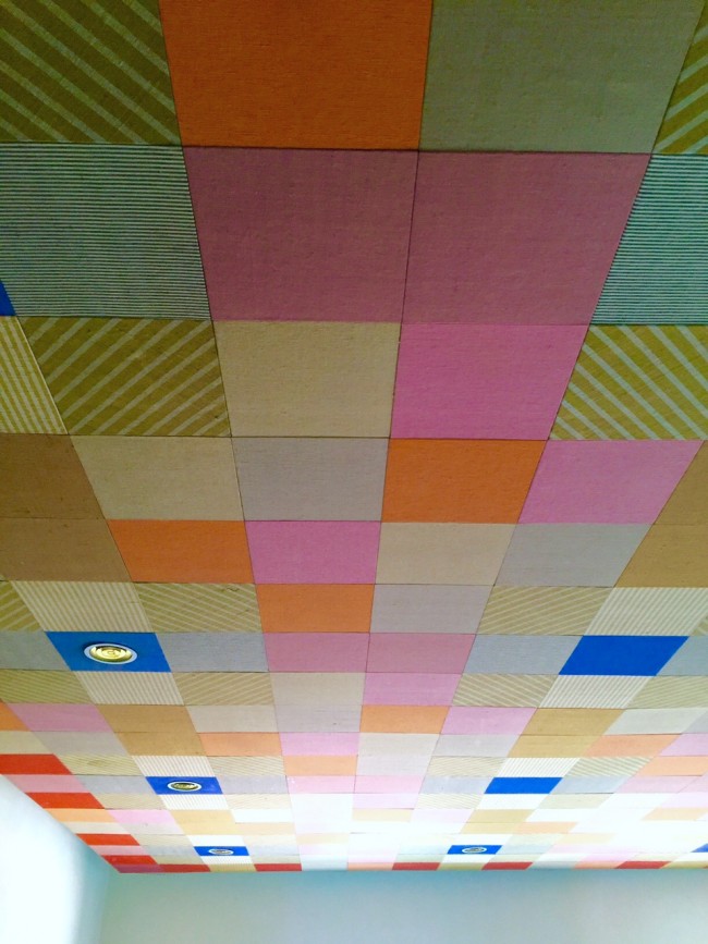
And the best part is, the textiles are completely original to 1966, the year that the restaurant was built. I can only imagine how vibrant the colors must have been then.
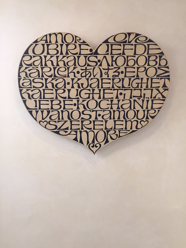
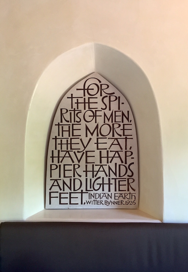
Another example of Girard’s beautiful typography.
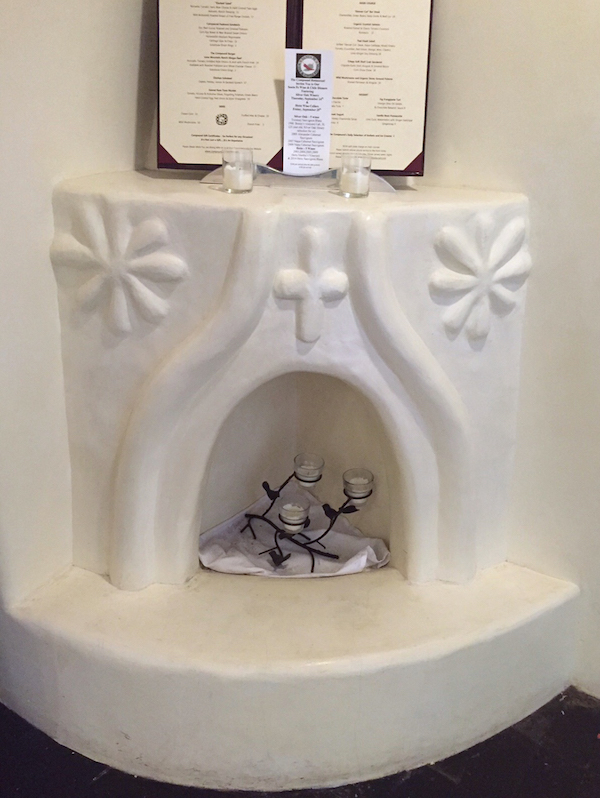
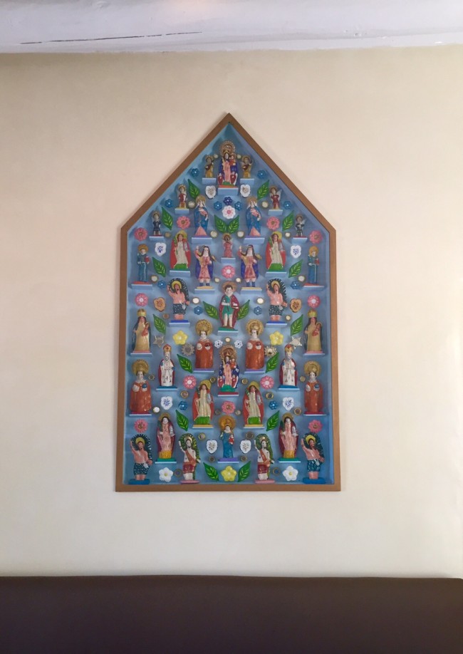
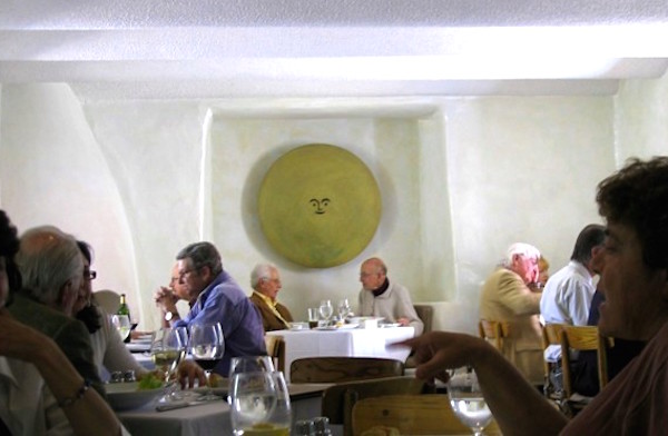
In addition to textiles, another one of Girard’s passions was folk art- the making and collecting of it. So it’s no surprise that a folk art tribute piece like this one would end up in one of his restaurant designs.
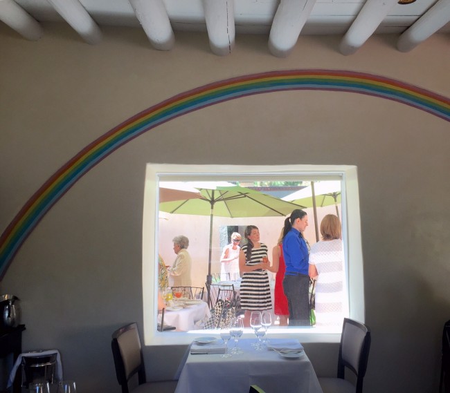
The rainbow is yet another touch of whimsy hinted at by the restaurant logo outside.
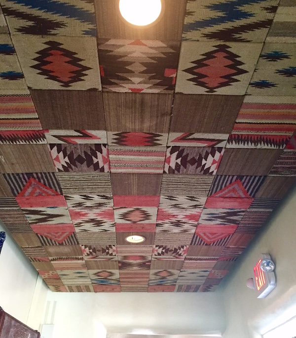
Another spectacular textile paneled ceiling, this one featuring woven textiles native to the area. Oh, how I wish I could have this in my home.
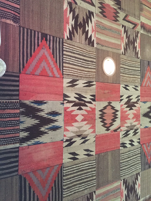
Image via
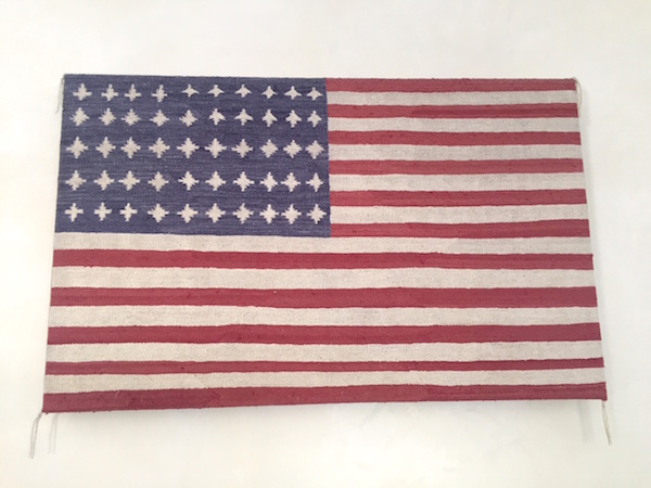
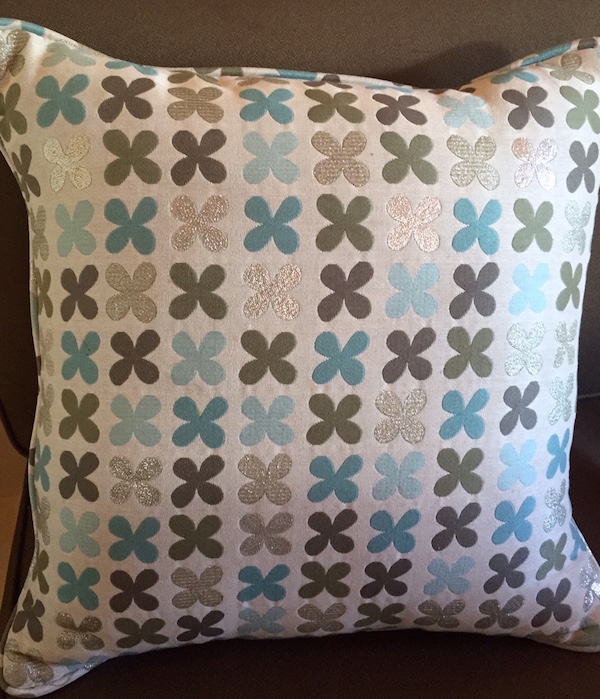
One of Girard’s beautiful custom textile designs used throughout the restaurant. You can buy the same pillow here.
*All images mine unless stated otherwise.
The end!

so interesting!!! we will have to go next year.