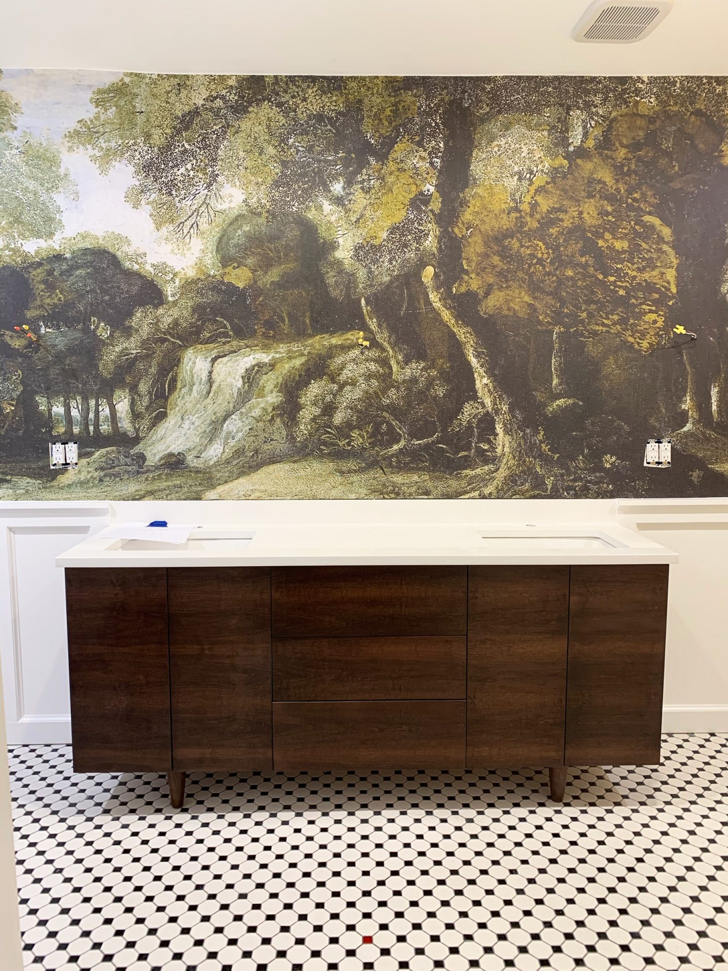

It’s week 5 of the One Room Challenge (oh my gosh, we are almost to the finish line), and this week, I’m sharing about the gorgeous custom vanity from Graeber Design!
Week 1 | Week 2 | Week 3 | Week 4 | Week 5 | Week 6 (you are here) |
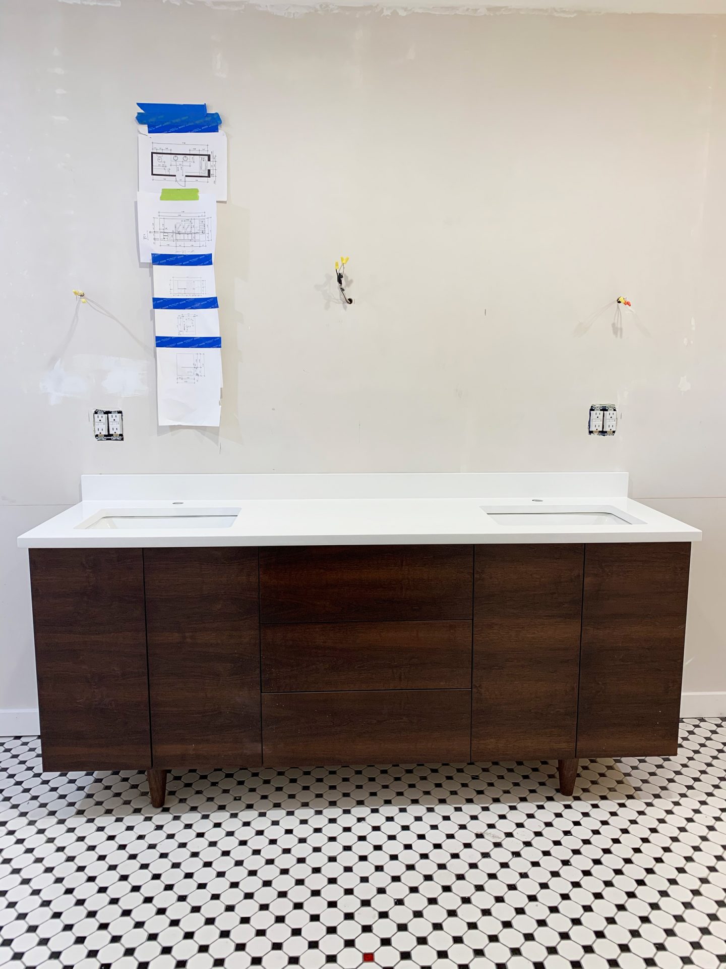
THE VANITY
From the beginning of designing our master bathroom, I had a very specific idea in mind for the vanity. I spent hours and hours searching online to find the perfect one- one that was both the size and style that I was looking for and was also in my budget. My options were slim.
Then, by a twist of fate, I was browsing on Instagram and came upon a post of a stunning table from Graeber Design. I clicked on the photo. Then I clicked on their profile. And there I saw it. A beautiful vanity that looked a lot like the one I had been dreaming about. After stalking more of their Instagram feed, I knew one thing: Graeber Design had to make my vanity.
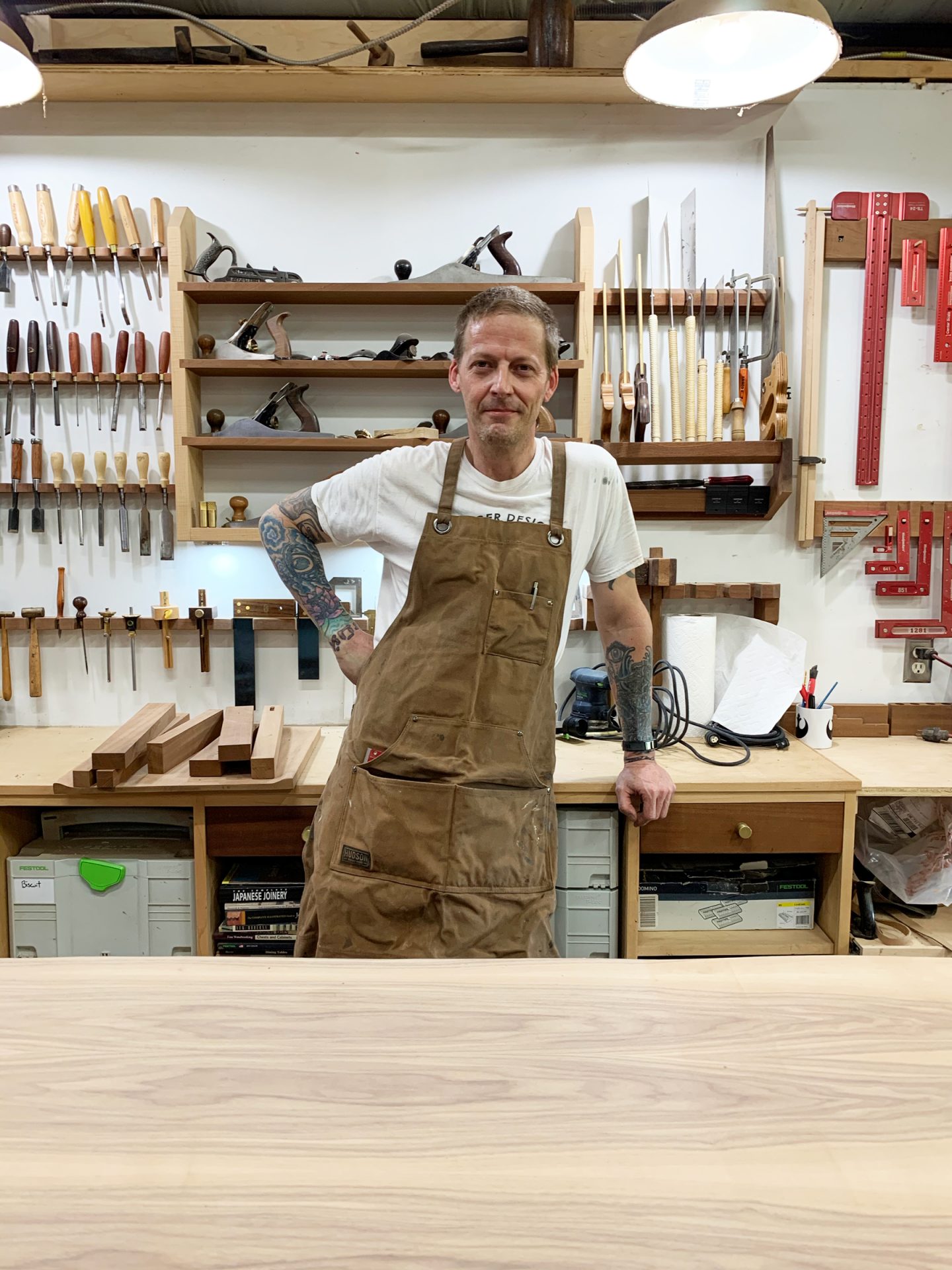
I say Graeber Design, but I really mean William Graeber. He’s the founder and artist behind the custom-furniture company. I quickly discovered from my Instagram stalking that his shop is based here in Oklahoma- in Edmond, to be exact. So I reached out to him with my request for a custom vanity, and he recommended I come by the shop to really see what he was all about!
When I got to the shop, I was amazed. When I say Willy is a true craftsman, I mean just that. He designs, builds and finishes each piece by hand here in his shop. I was able to check out some custom pieces he was working on before we got down to business, as well as some stock designs he has listed on his site. Seeing the quality of his materials and his stellar craftsmanship made me even more anxious to start designing my vanity!
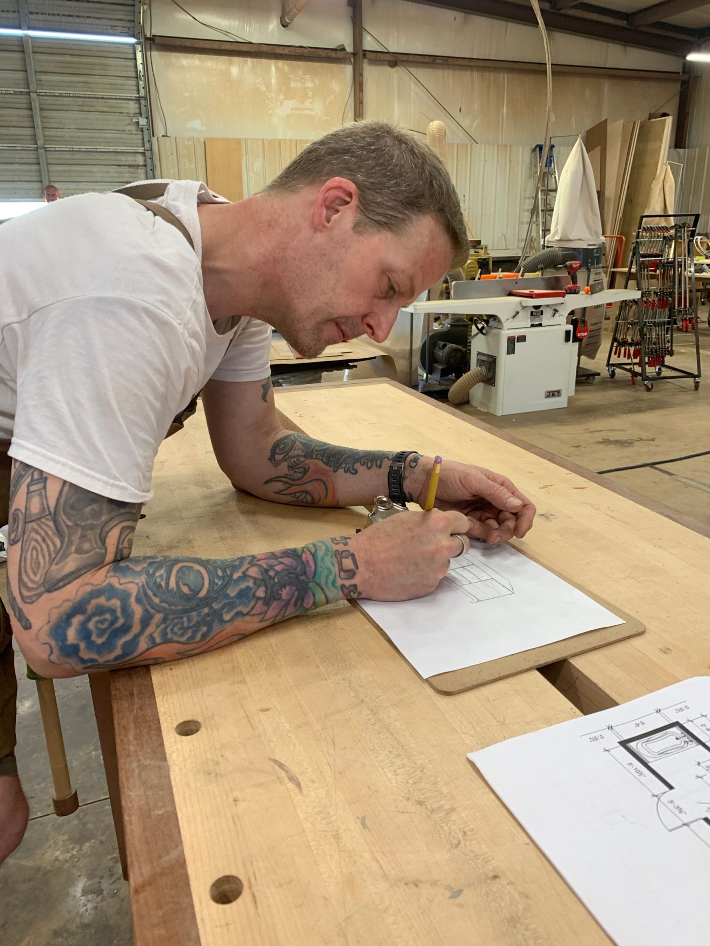
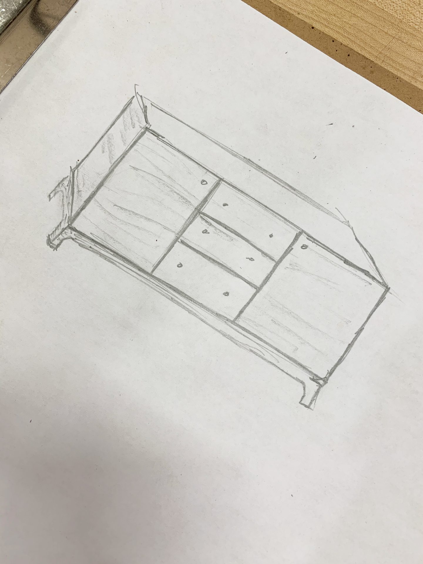
To start, I showed Willy my floor plans and gave him some basic overall dimensions. We then gathered around his work bench to start sketching. Here’s a little peek at the rough sketch.
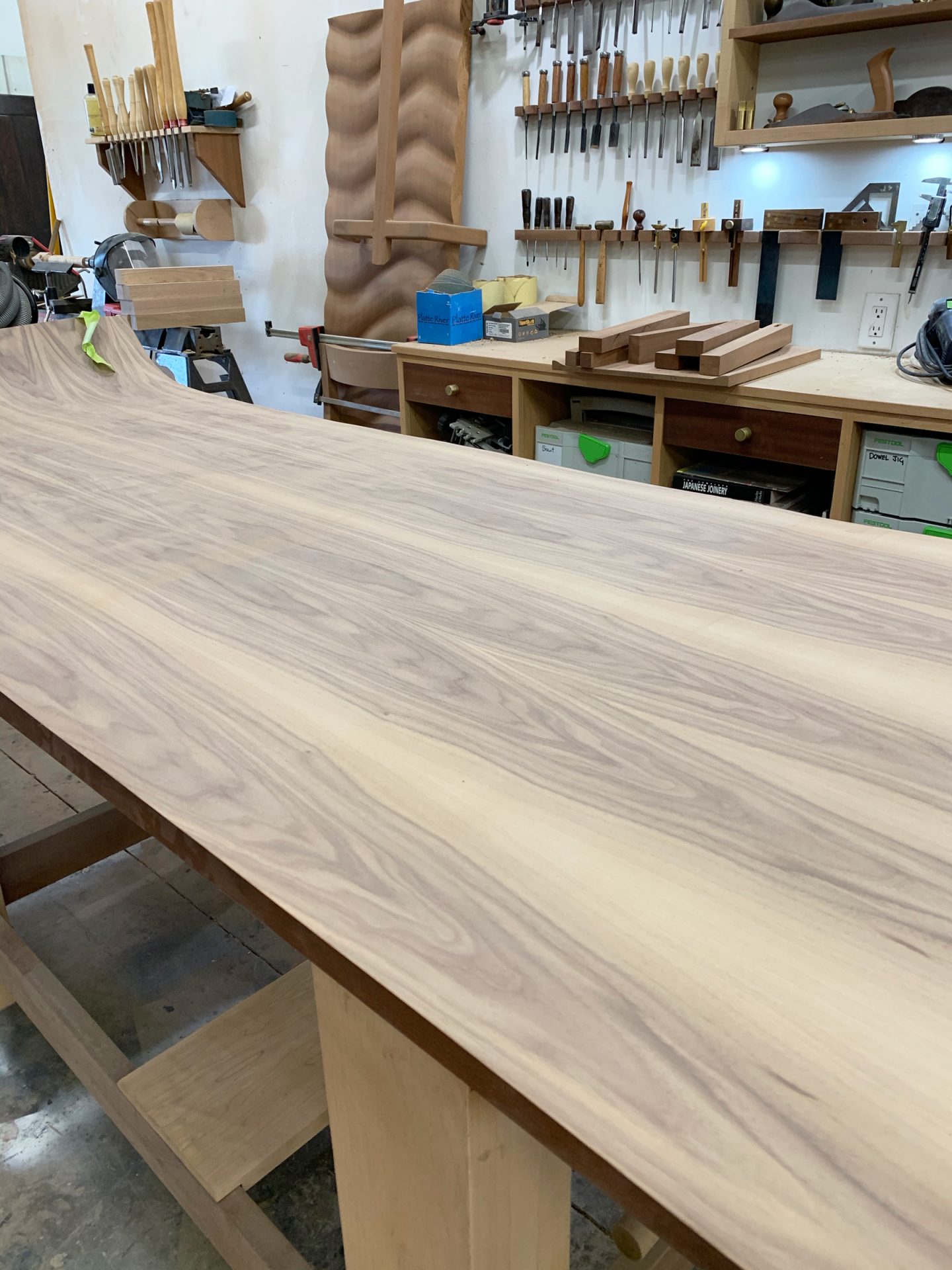
I knew I wanted sleek lines, plenty of storage, and a beautiful wood grain- something very Midcentury-inspired. Willy ran over to grab something from his pile of wood and quickly returned with this beautiful walnut veneer. He mentioned that we could do a “wrap around” wood grain, which means the grain would flow continuously from side to side on the vanity. I was game!
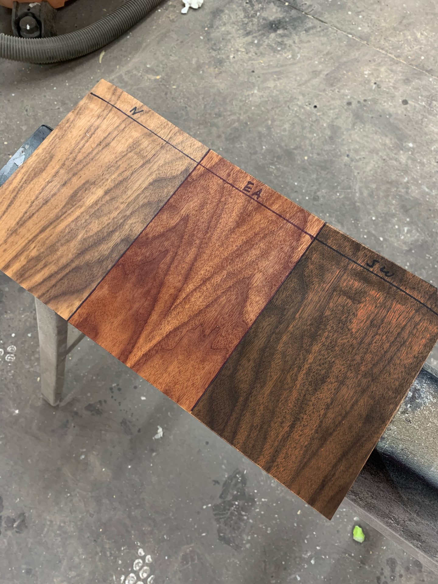
Our next challenge was to pick a wood stain. Willy makes all of his own wood stains in house, and this was just a small sampling we chose to swatch. We ended up opting for the stain on the far right- a dark mahogany stain in true MCM style.
Scroll below to see the final product in all of it’s glory (sans countertops and knobs, of course)!
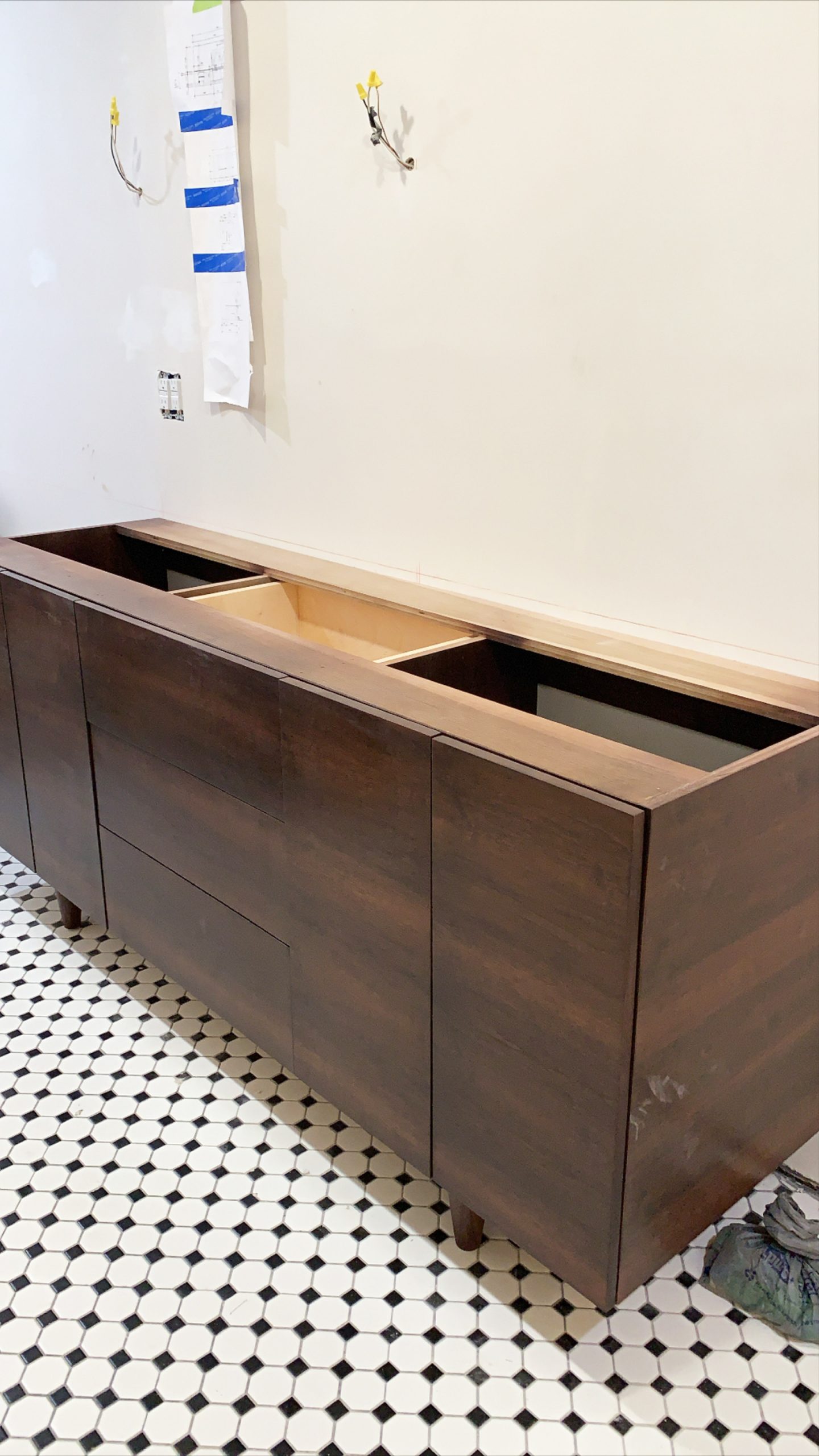
Ahh, isn’t she a beauty!?! She’s the very first thing you see when you walk into our master bathroom, and Willy designed and crafted a vanity fitting of perfect first impression.

Be sure to check out some of Willy’s other amazing designs on both his website and Instagram.
If you haven’t already, I definitely recommend taking some time to check out the other amazing transformations by the other guest participants!
A special thank you to Graeber Design for making this beautiful bathroom a possibility, the One Room Challenge and Better Homes & Gardens for hosting, and to Jennifer Hunter of Jennifer Hunter Design for guiding me through the design process!

That is one incredible vanity – what a talent! Looking forward to seeing your reveal!
Absolutely stunning! He is extremely talented. Love how your two visions came together! This is going to be a stunning space…cant wait to see it come together!