
It’s week 4 of the One Room Challenge – crazy, right?! This week, we have accomplished a much smaller check-list of items than last week, but the things we have been able to check off our list make a huge visual impact!
We accomplished 4 big things this week:
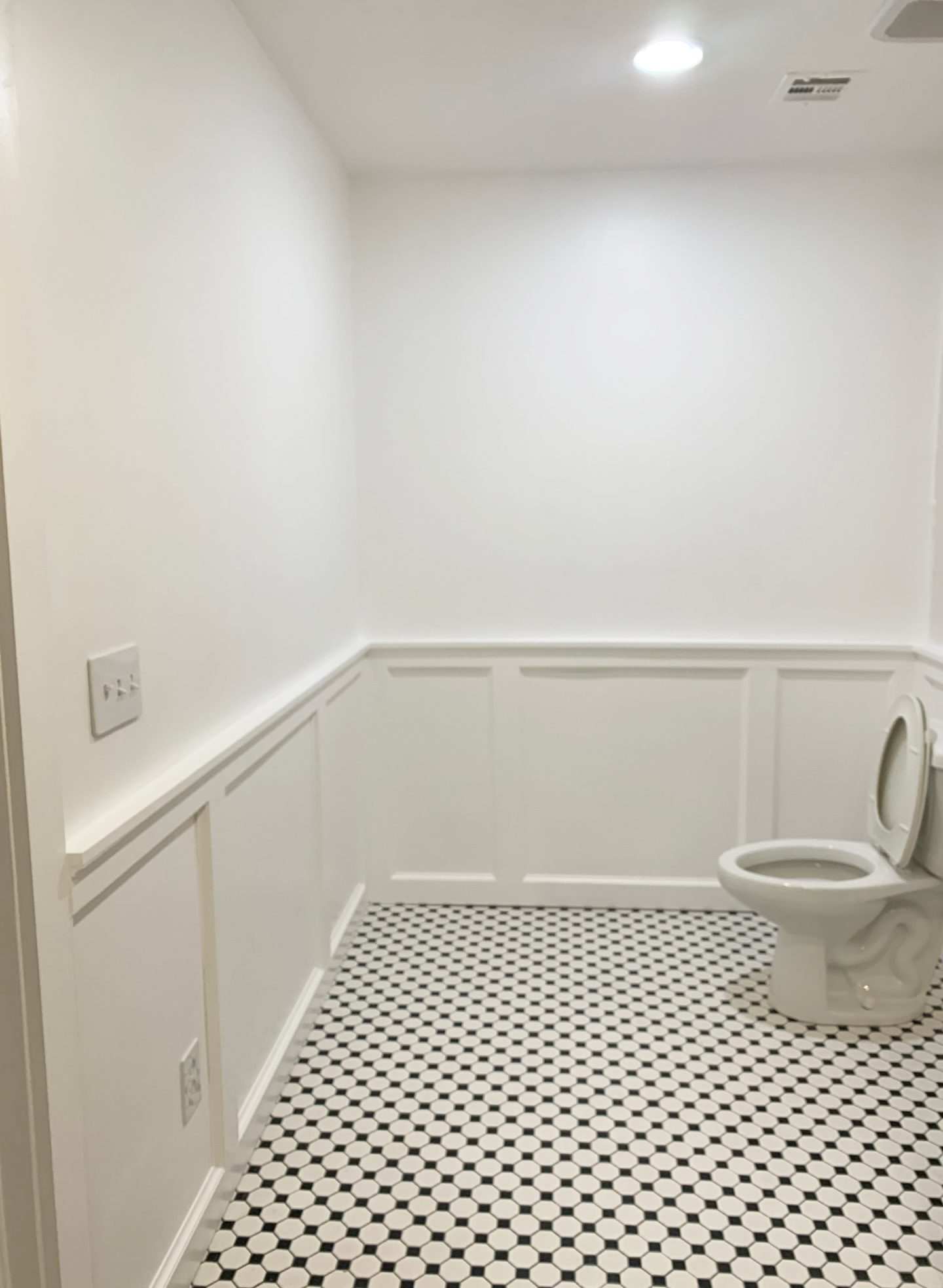
- Installed the black and white hexagon floor tile
- Installed the yellow tile shower/tub surround
- Installed and painted the board and baton (aka: wainscoting)
- Painted the walls and trim
Week 1 | Week 2 | Week 3 | Week 4 (You are here) | Week 5 | Week 6
TILE PLACEMENT
The first thing I want to address with you all is tile placement. Who knew that there were hundreds of different ways to lay tile. But, there are, and the way you lay tile can completely change the look of the space!
Let’s start with the floor tile. I selected this classic black and white hexagon tile. I considered two different ways to lay it: 1) at a 90 degree angle, which would give a more classic, traditional look to the space, or 2) at a 45 degree angle, which give the space more visual movement and is a bit more unexpected.
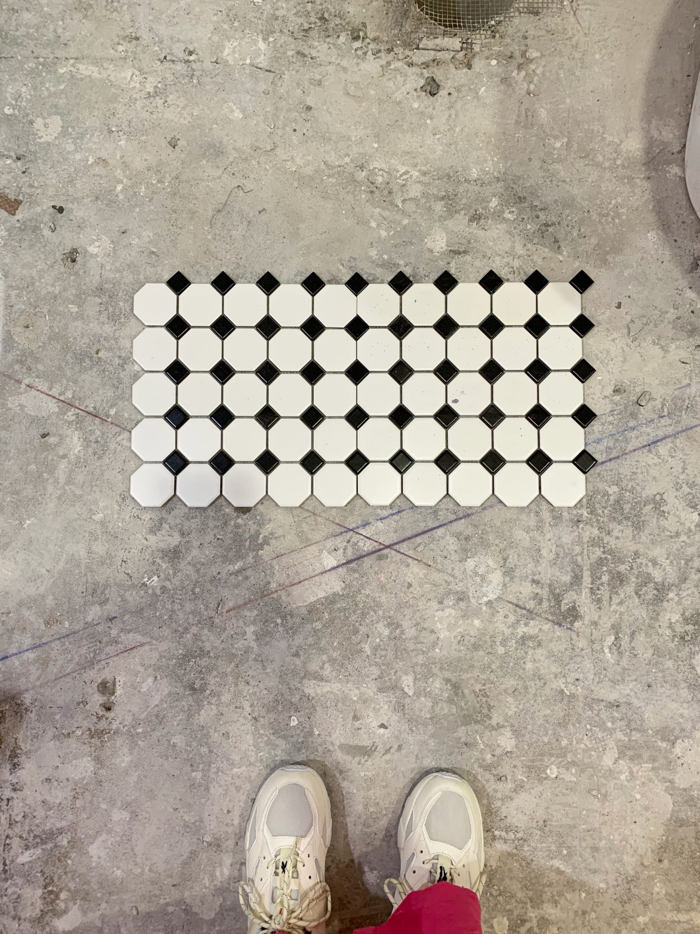
Well, if you know me, you know me- I went for the unexpected orientation, and laid the tile at a 45 degree angle.
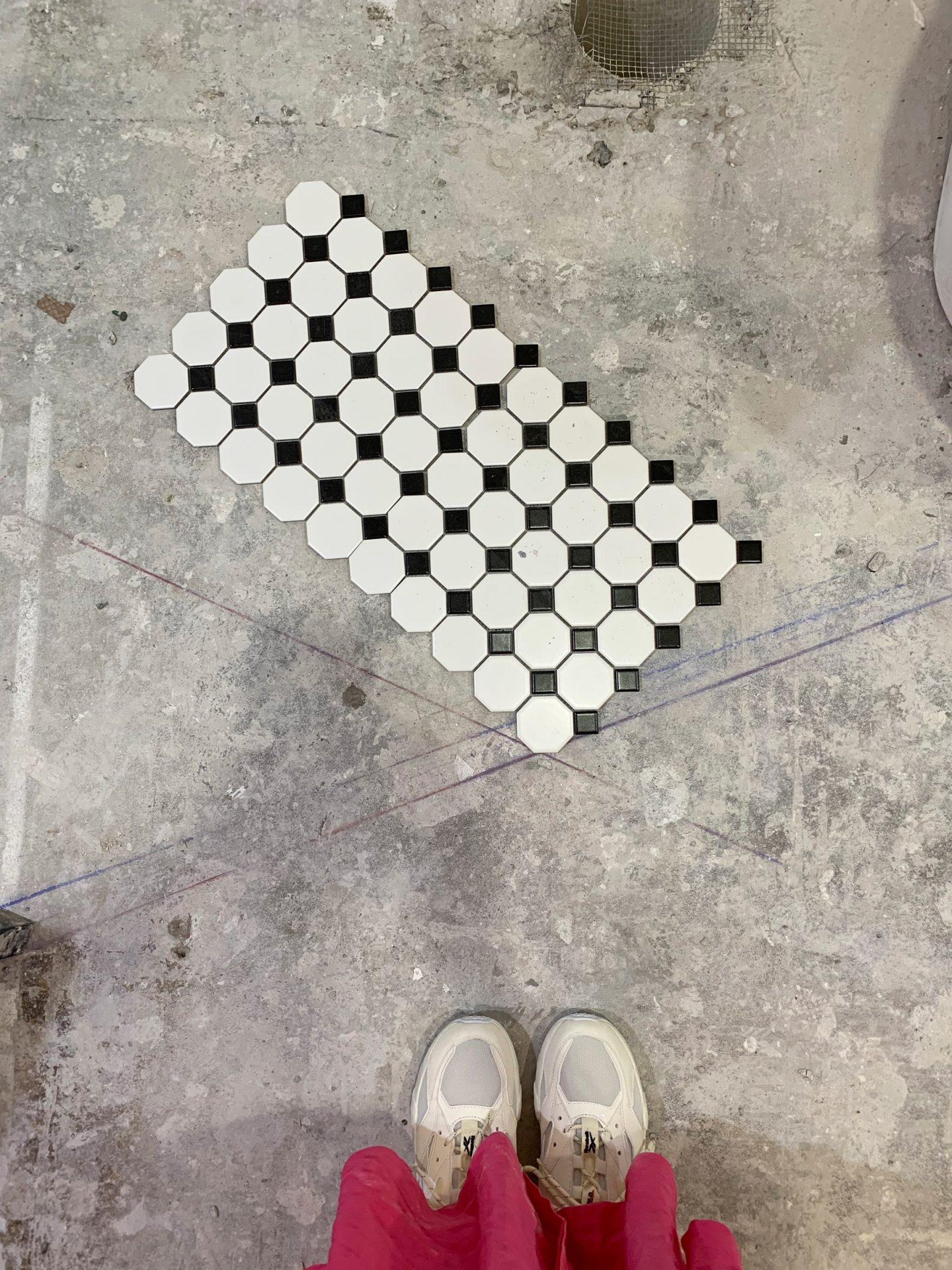
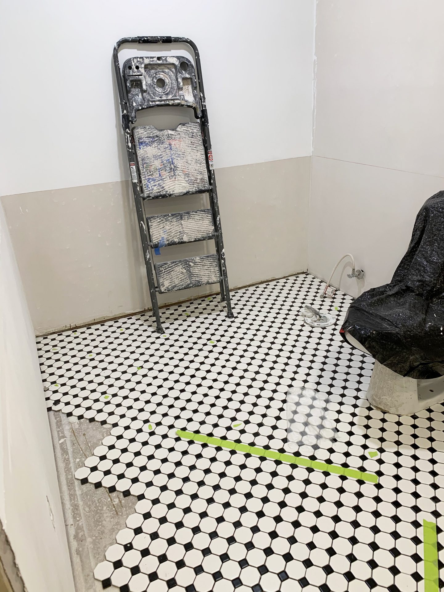
As you can see, laying the tile at a 45 degree angle creates more of a diamond pattern, as opposed to a grid-like one. I’m digging it! What do you all think?
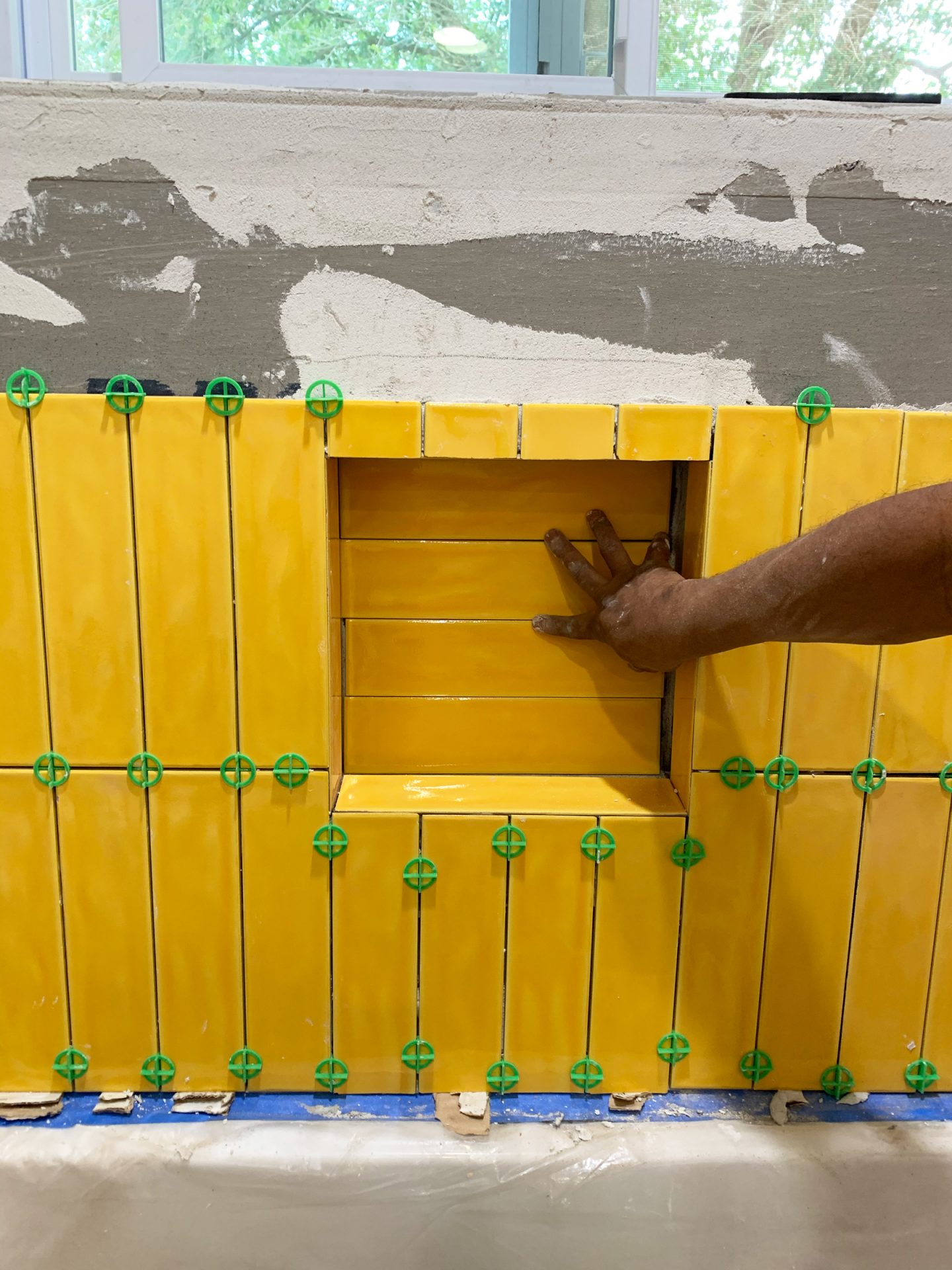
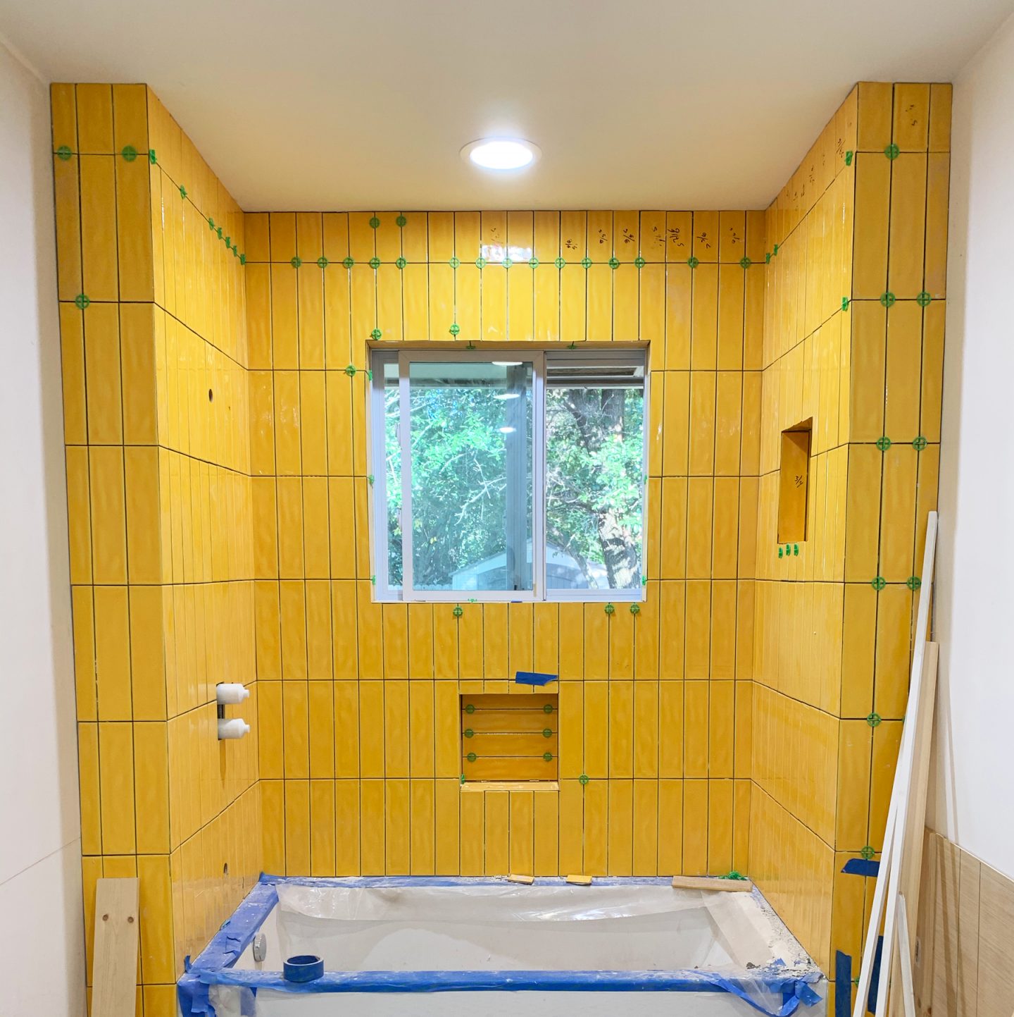
Now, let’s talk about the shower tile. I chose this beautiful yellow glazed ceramic subway from Travis Tile, and as soon as I saw it, I knew I wanted it to be laid in a stacked, vertical orientation as opposed to the traditional way of laying subway tile. I don’t know about you all, but laying it this way seems really fresh and inspiring to me. And, as a bonus, it helps draw the eye upward and adds to the illusion of height in the space!
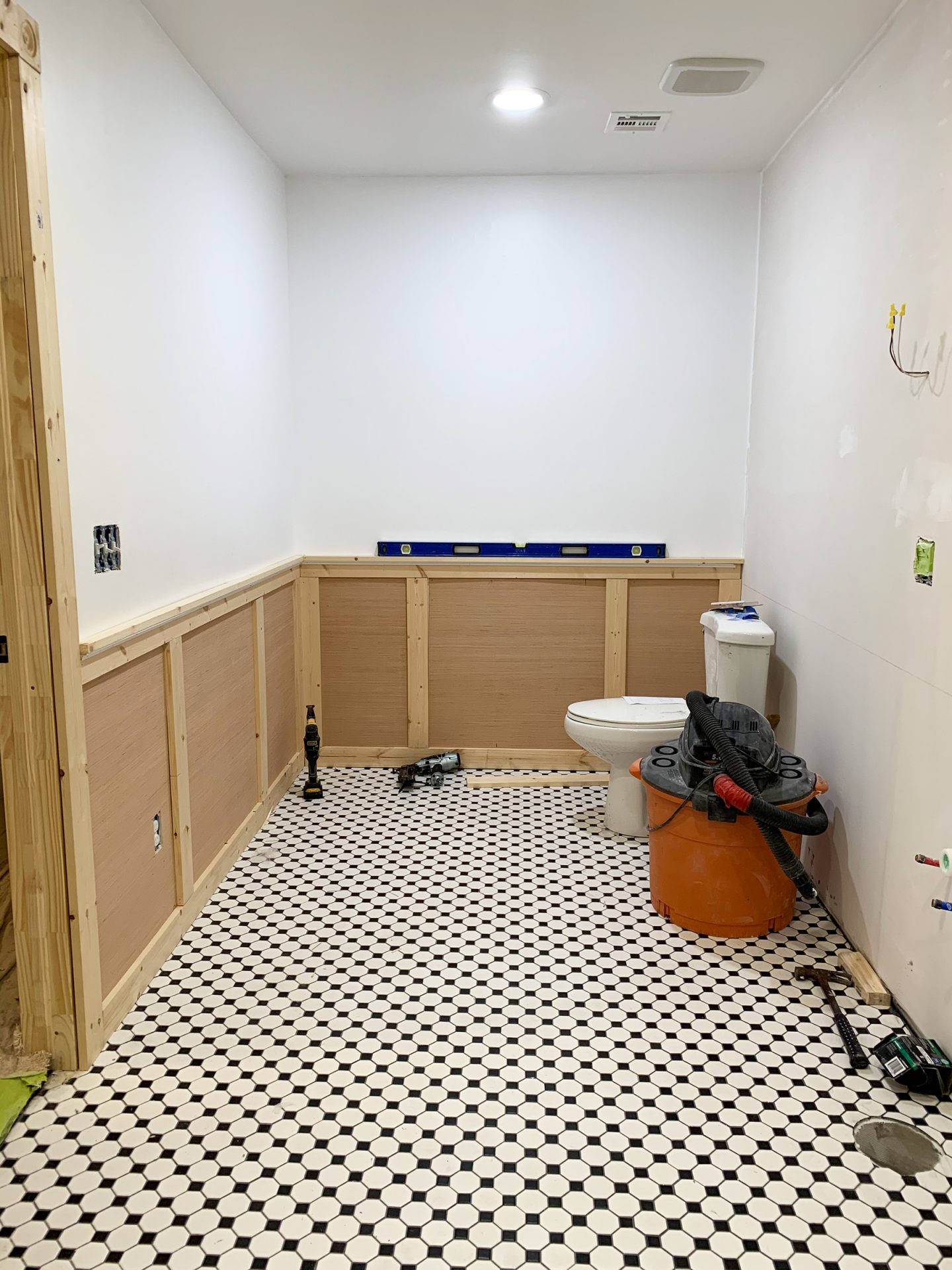
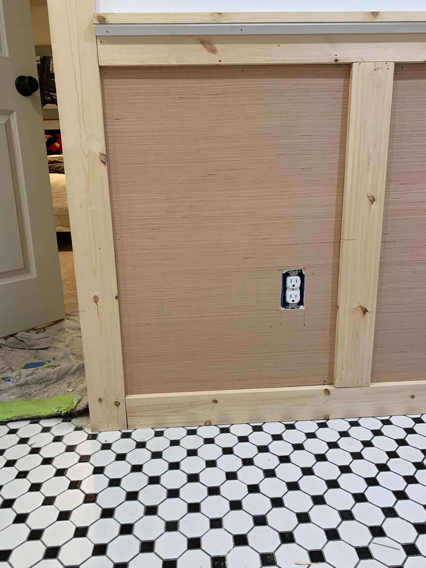
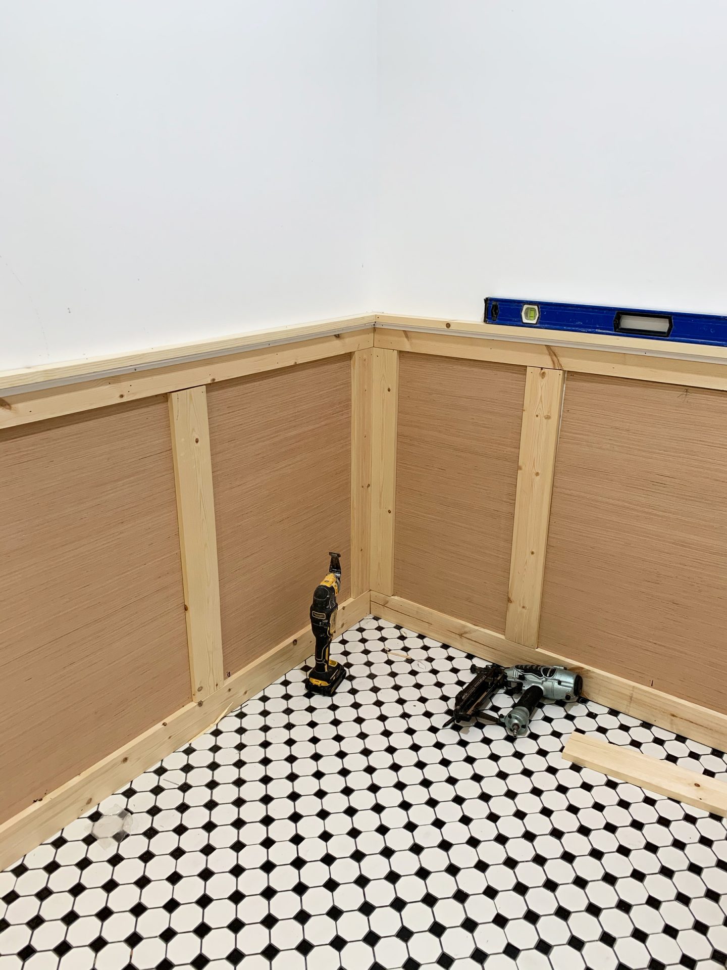
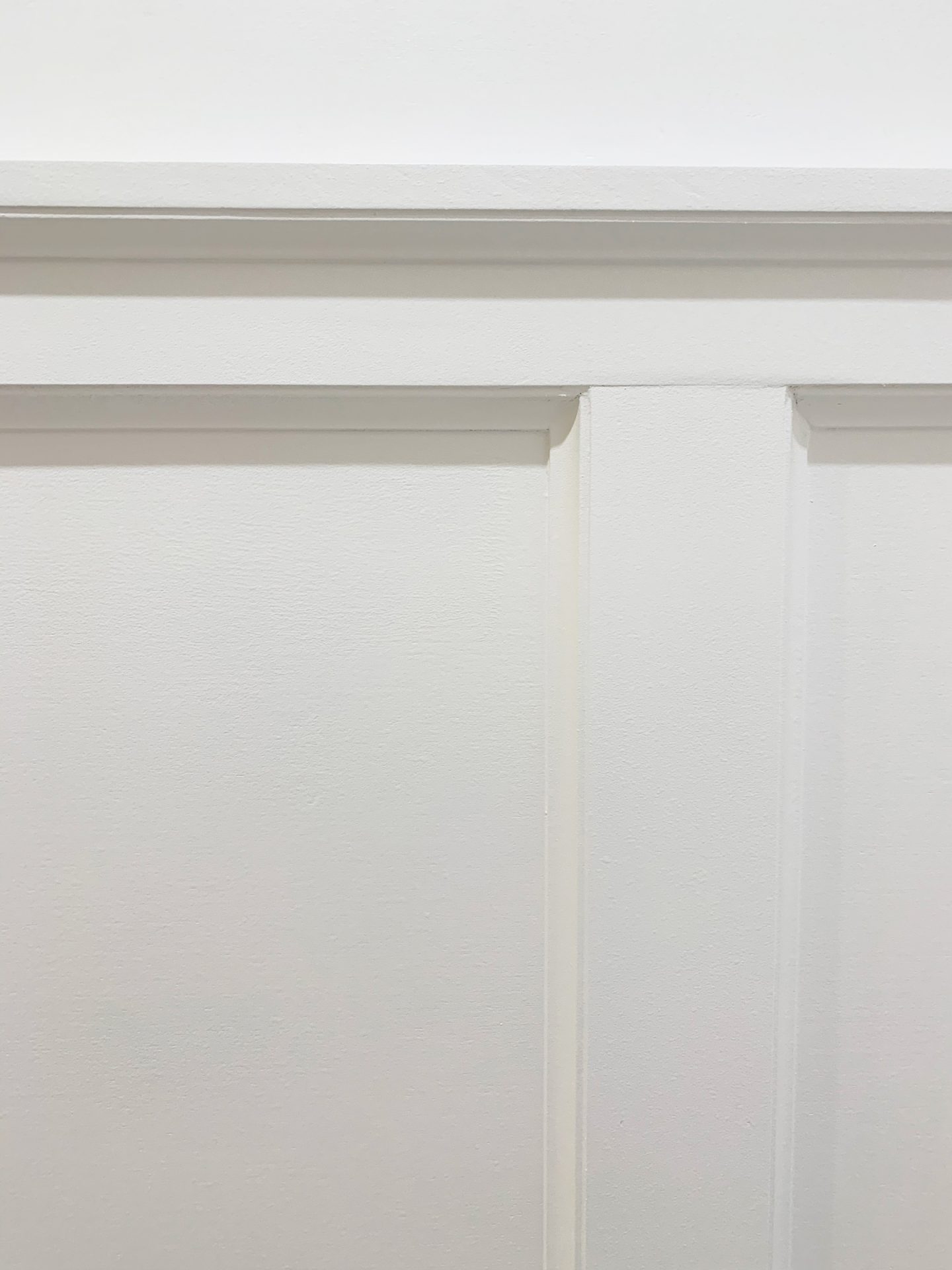
BOARD + BATON
Designing and laying out the board and baton was a bit tricky, due to the different sizes of wall space. When it came to the design, I modeled it after the board and baton in our living room, for the sake of consistency (and having one less thing to think about).
THE PAINT
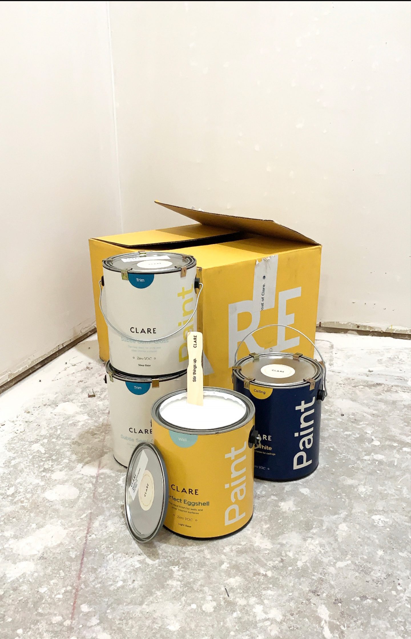
Ahh, now this is the part where the bathroom actually starts to look like a bathroom: the paint! I knew I wanted white walls and white trim to allow the colorful tile and accessories within the space to really *pop*, but the question of what kind of white was a bit overwhelming to me. Go to the paint store, and there are HUNDREDS of shades of white. OMG.
So I did a little bit of research. And in my research, I came across Clare Paint. I feel as though the best way to describe Clare would be to draw a comparison (bear with me here)… Going to Home Depot for, say, Sherwin Williams or Benjamin Moore paint, would be like going to into DSW to buy a basic pair of black stilettos. You know exactly what you want, and what you’re looking for is so classic, do you really need 400 options? But then, you go into your favorite boutique, and there is a curated assortment 10 black heels for you to choose from. And you love them all! That boutique, my friends, is Clare Paint.
Clare paint is the boutique of paint companies. Rather than offering thousands of colors, they have an intentionally tight line of hand-picked paint colors that are both classic and on-trend. When I was browsing their site for the perfect shade of white, I had 5 beautiful shades to choose from. And rather than having to figure out on my own which shades were cool, which were warm, and which were neutral, Clare had super helpful descriptions of each color that answered all of my questions about color temperature!
I could go on and on about Clare paint, but here are just some of the reasons I will be using Clare on my next projects:
- All of their paint is self-priming. No priming means less time painting!
- Their paint is washable and extremely durable, making it perfect for anyone who has little humans around!
- All of their paint is Zero VOC and is free of colorants, which means no hazardous air pollutants or EPA chemicals to worry about!
- It applies easily and smoothly, making it a perfect paint for the novice painter!
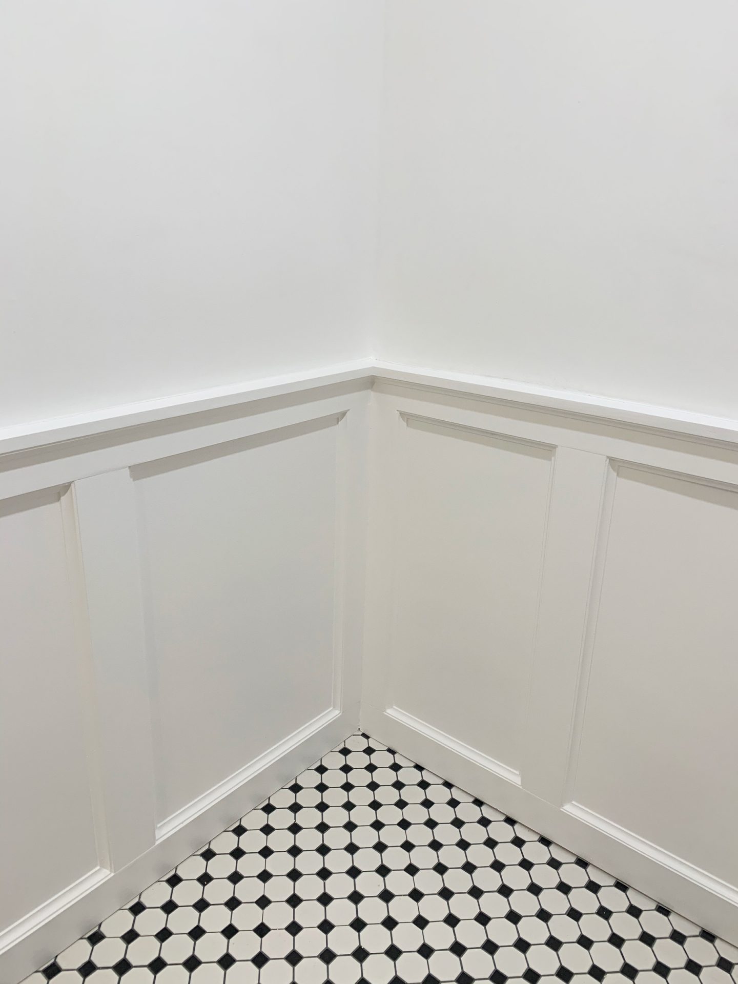
When it came to color, I quickly settled on Fresh Kicks, which is a classic white with neutral undertones, for both the trim and the wall paint. Doesn’t it brighten up the space? Such a difference from the beige invasion of the pre-demo bathroom!
Well, that’s it for week 4. Stay tuned for next week- I’ll be showing you the vanity and the gorgeous mural!
If you haven’t already, I definitely recommend taking some time to check out the other amazing transformations by the other guest participants!
A special thank you to Clare Paint for making this beautiful bathroom a possibility, the One Room Challenge and Better Homes & Gardens for hosting, and to Jennifer Hunter of Jennifer Hunter Design for guiding me through the design process!