Today, I’m having major room lust over one room in particular: the office of Mindy Kaling, which graced the cover of Domino Magazine’s September issue. Interior designer Nathan Turner created a space for Mindy that is bright, quirky, and none-to-serious – all adjectives I would use to describe the comedian herself. Let’s take a look…
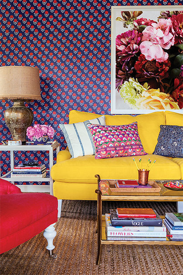
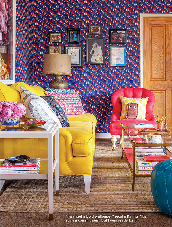
Like the image says, Kaling wanted to go bold when it came to the wallpaper. She opted for Serena and Lily’s Blossom wallpaper in navy, a design decision that really sets a precedence for the rest of the space.
For the couch, Turner selected this bold yellow sofa with white legs. To keep things from feeling too busy, he went with a neutral woven jute rug which allows the wallpaper, throw pillows and accessories to stand front and center.

And how could I not mention that fabulous over-sized photograph of flowers behind her? The scale of not only the canvas, but of the flowers themselves, is a perfect compliment to the tiny pattern on the wallpaper behind it. Rather than compete with the wallpaper, the photograph of the flower enhances it!

All images via Domino
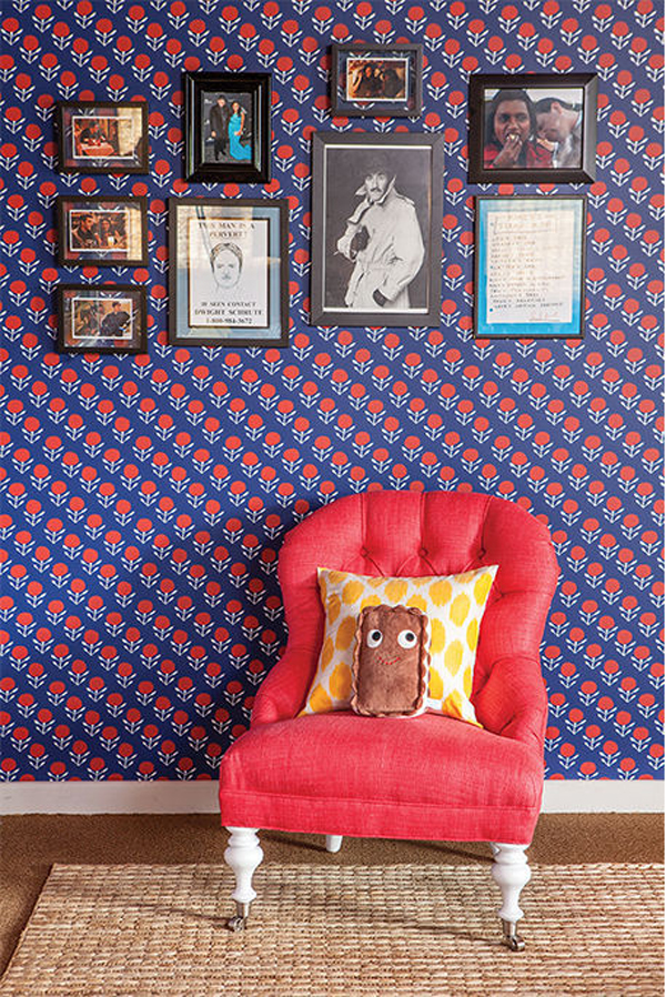
Finally, to keep things from feeling too serious, Mindy framed images of different text and inside jokes from friends. Those images, coupled with the bacon pillow, give her office a personality fitting of the person inside of it.
So what do you guys think of the space? Is it perfect? Too colorful? Does it make you want to play, get some serious work done, or a little bit of both?

