

Welcome to Week 2 of the One Room Challenge! If you missed my Week 1 post, you can check it out (hint: it’s a beige invasion) here. Today, I’m going to be sharing some of the inspo for my Master Bathroom remodel, along with my room boards of what I envision the space to look like when it all comes together!
Week 1 | Week 2 (You are here) | Week 3 | Week 4 | Week 5 | Week 6
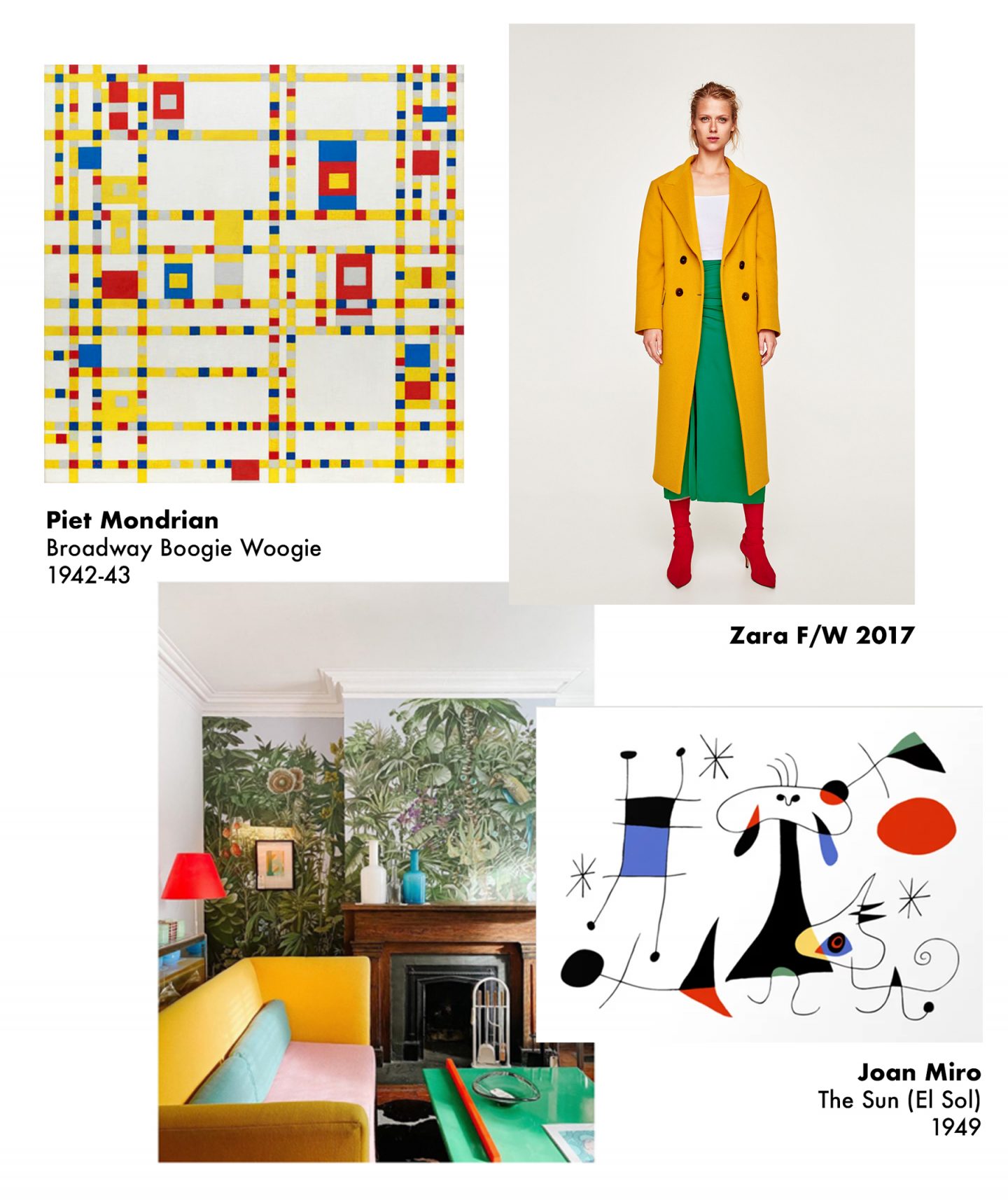
If you follow me on Instagram, you already know that I am no stranger to bright colors. I am drawn to them like a gnat to an old banana. I incorporate them into my wardrobe, and can’t help but do the same with my home. Moreover, I am actually drive by color. When I set out to design a space, the first thing that I decide upon is a color scheme. And that color scheme dictates everything else- from the materials I use, to the furniture and finishes I select, to the way I accessorize the space.
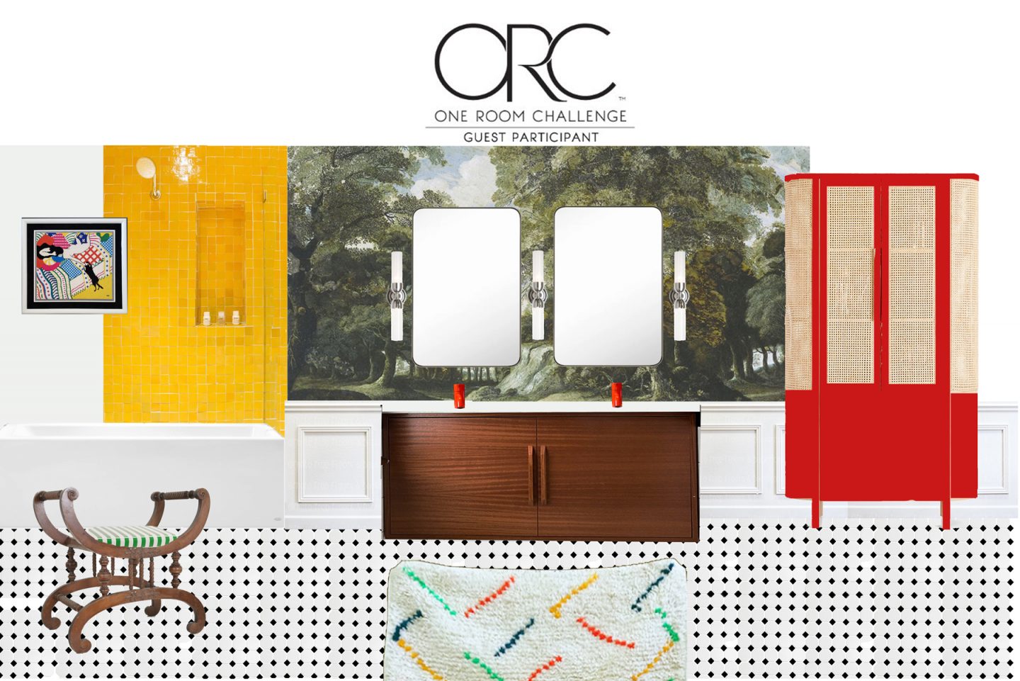
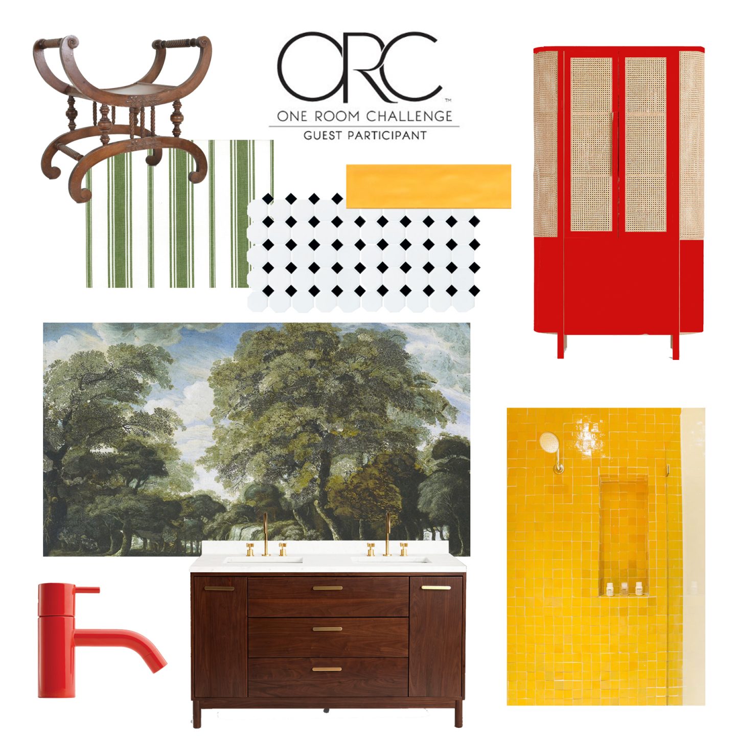
This go around, I was super-inspired by Mondrian-like primary colors- specifically school bus yellow, fire engine red, and pine green. I was also very inspired by Mondrian’s use of color-blocking throughout most of his work.
In terms of style, I was going for a similar “vibe” as I did with color: sleek and modern with antique touches.
This is where Miro comes in. I’ve been finding inspiration in his work for the past 4 years or so- not only his use of color, but the relationship between positive and negative space, with the negative space being more dominant. I also appreciate his use of black to highlight the shapes and colors within his work. This is where the black and white octagonal tile, the yellow subway tile, the shiny red faucets, the green and white striped fabric come into play.
But then, there was this part of me that craved something organic- a ying to the yang of the ridigity of color-blocking. That’s where the beautiful lush mural from Walls Republic (more on that in future posts), the texture from the caned linen cabinet, and oushak rug find their purpose.

Here, you can see my mockup of the space; how I envision the bathroom to look once we’ve ripped out the beige wall-to-ceiling tile, given it a fresh new coat of paint, laid the tile, and added furniture and accessories.
Until next week! And if you haven’t already, I definitely recommend taking some time to check out the other amazing transformations by the other guest participants!
A special thank you to the One Room Challenge and Better Homes & Gardens for hosting, and to Jennifer Hunter of Jennifer Hunter Design for guiding me through the design process!